Refugee Week is a project where design works as a tool for orientation: it helps hold many voices, organisations and formats within one coherent system, making complex information accessible, readable and connected. For me, this is one of those cases where the visual solution supports the content while also shaping how it is understood, bringing fragmented materials into a clear, cohesive publication.
What was delivered
⇢ Refugee Week 2025 evaluation report.
⇢ Leaflet with the Refugee Week events programme.
⇢ Interactive social media announcement post.
Key Achievements at a Glance
⇢ Interactive evaluation report. An interactive evaluation report produced, bringing research, data and visual materials together into a single readable publication.
⇢ Link architecture and navigation. Information and link architecture designed to provide a clear reading route and fast access to external sources.
⇢ Editorial design system. A modular grid and typographic hierarchy established to maintain consistent readability with high content density.
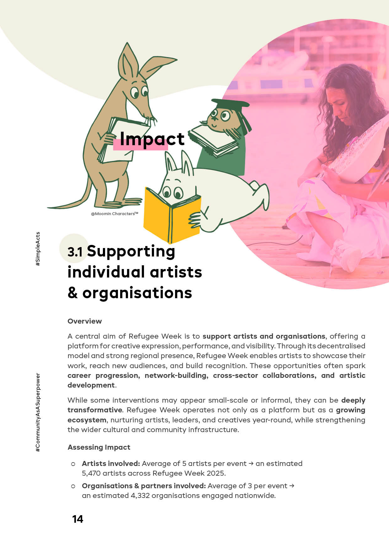
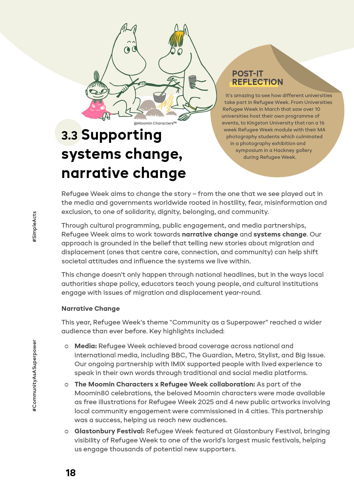
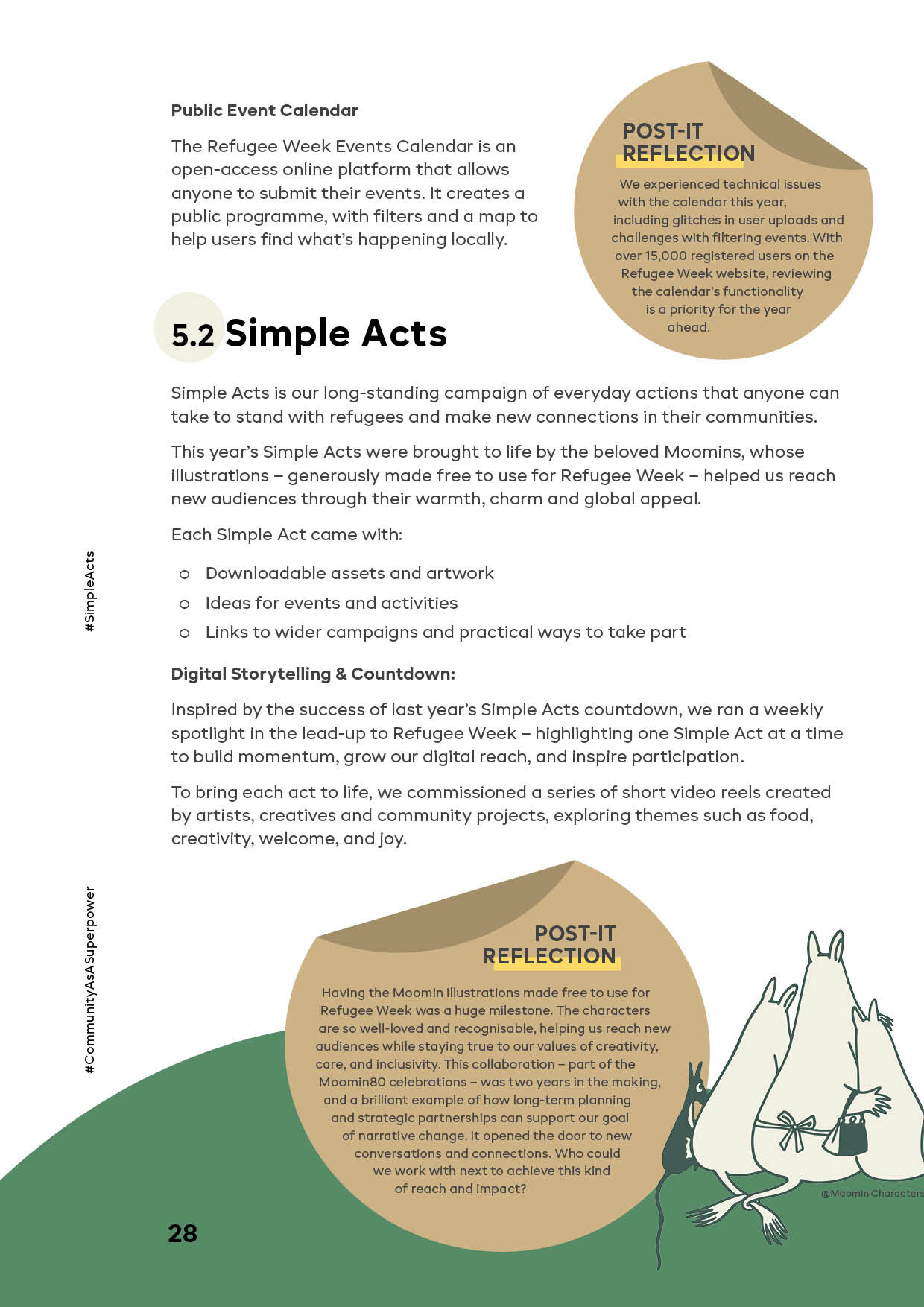
⇢ Integrated visual narrative. Moomins artwork and Refugee Week identity elements integrated, with characters used as a subtle navigational and narrative layer.
⇢ Public-facing communication materials. Communication assets prepared across channels, an interactive social post and an events programme leaflet.
Report, structure, navigation
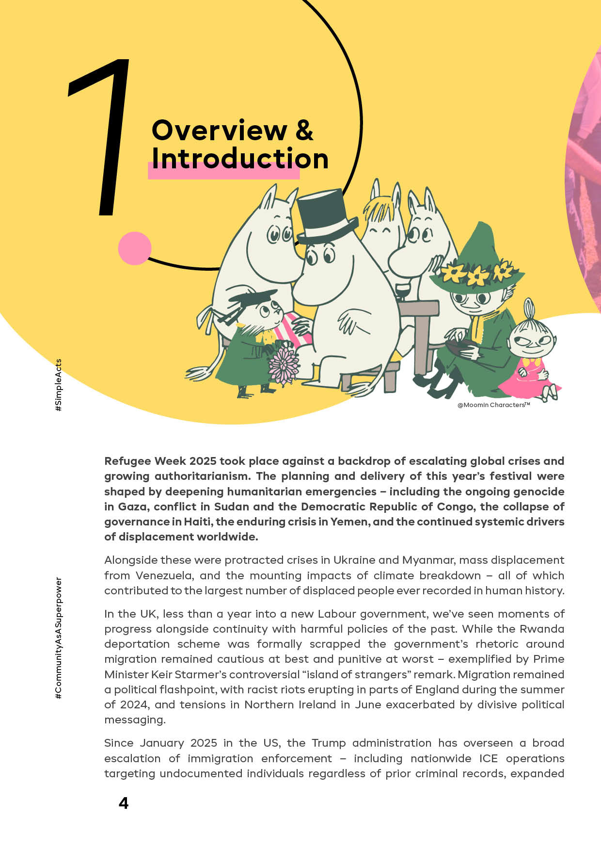
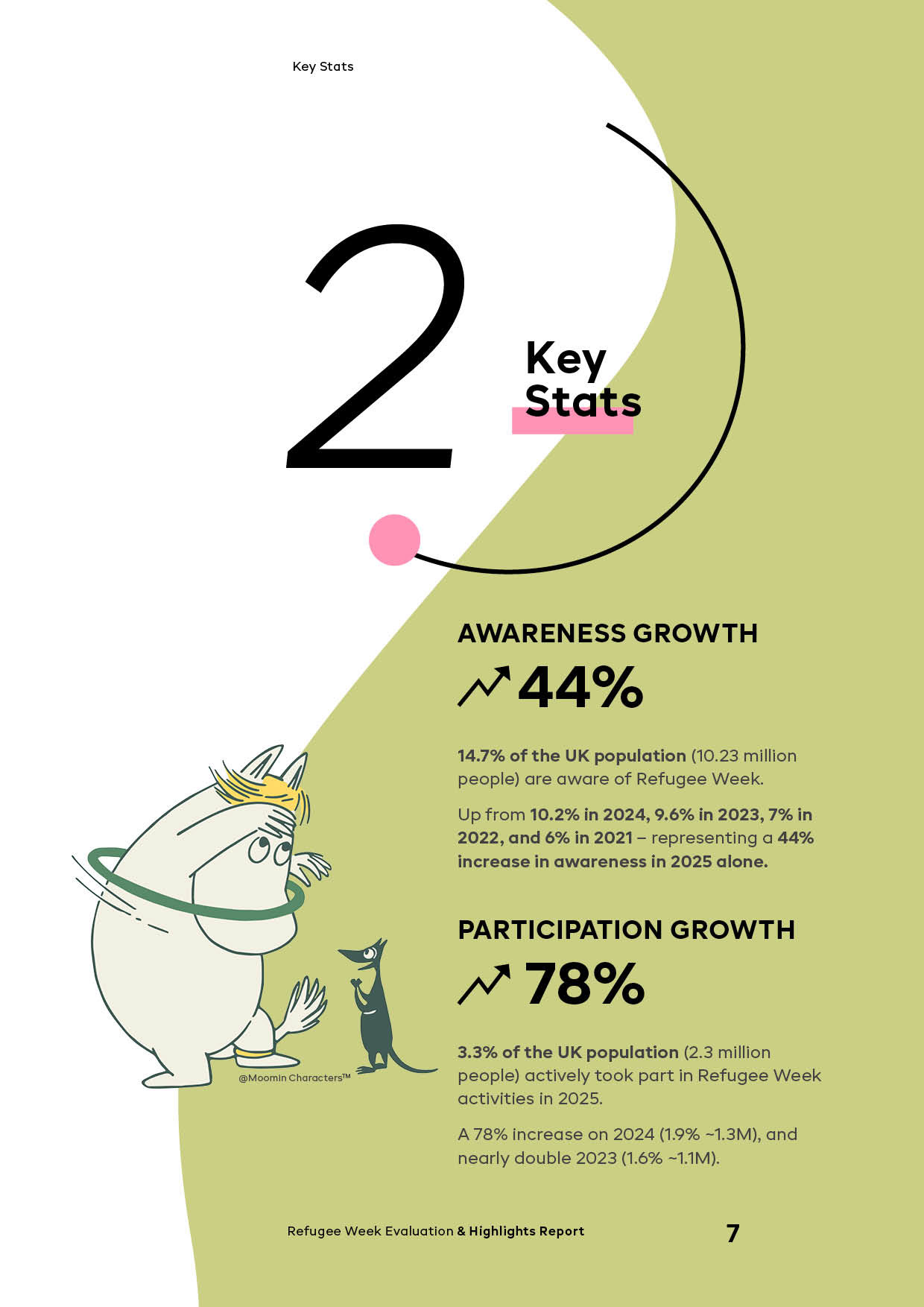
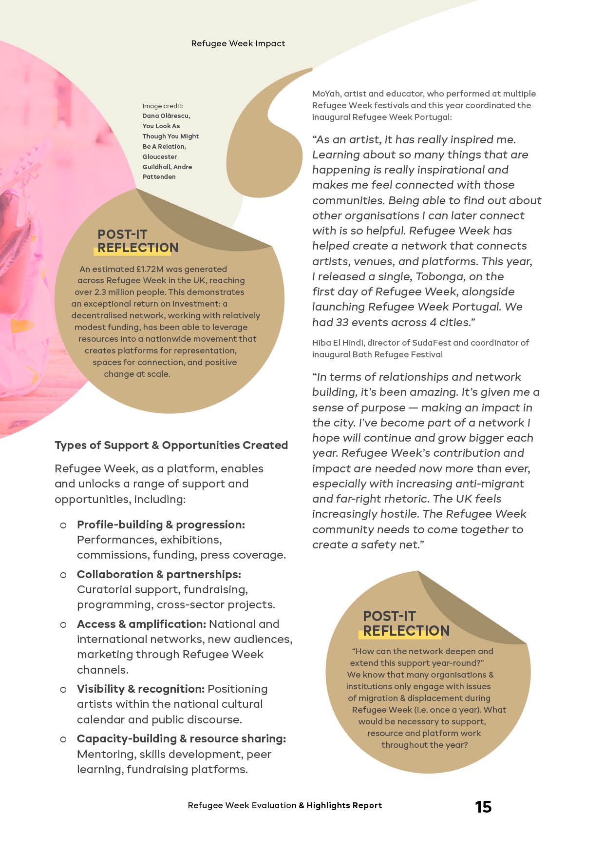
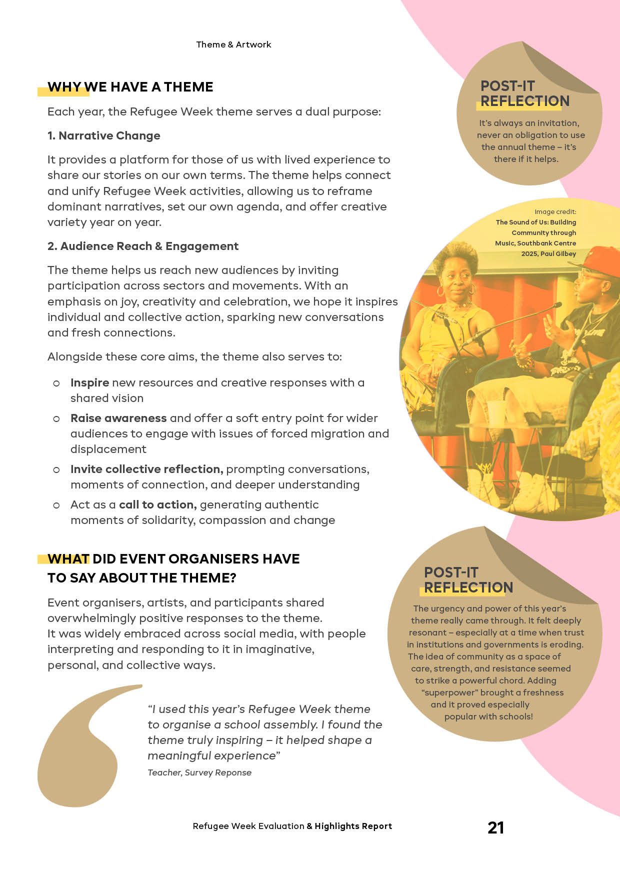
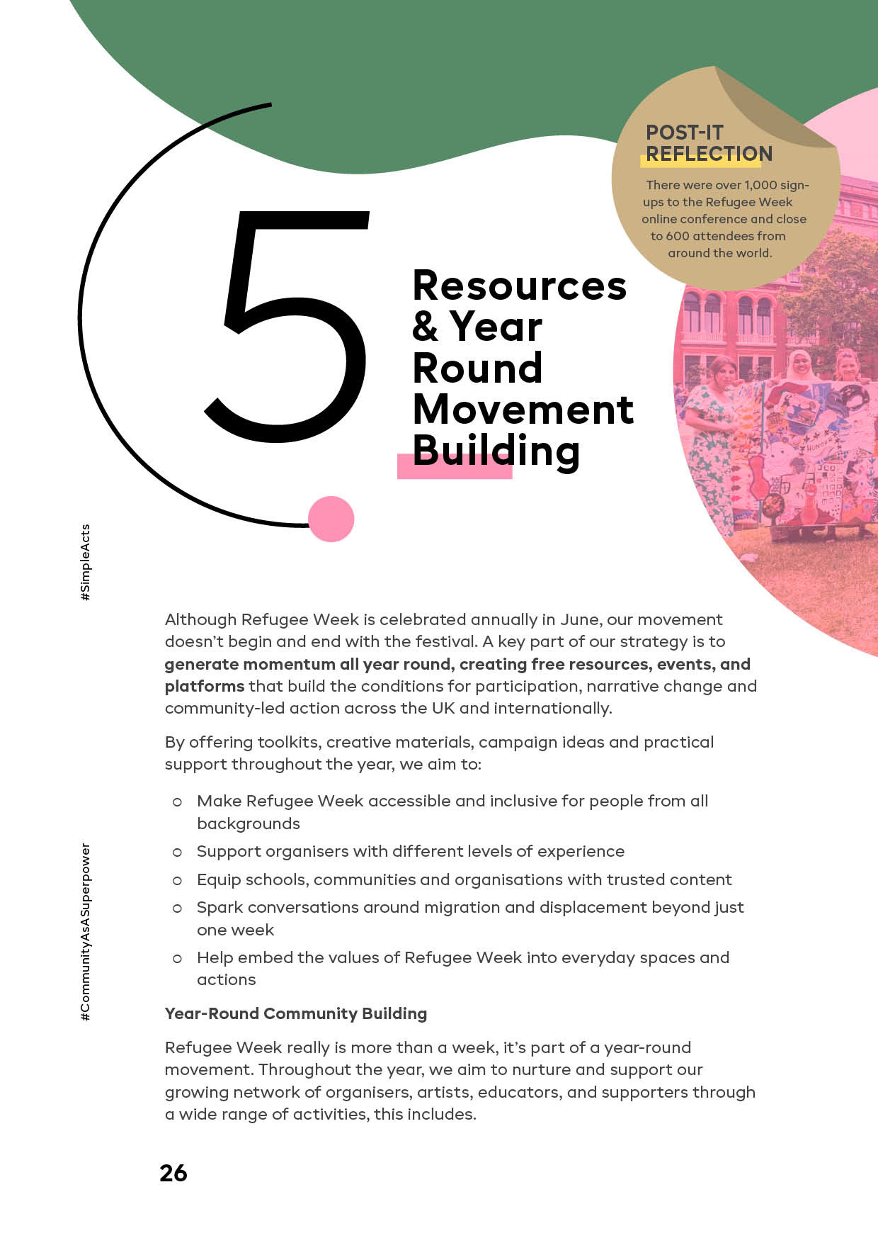
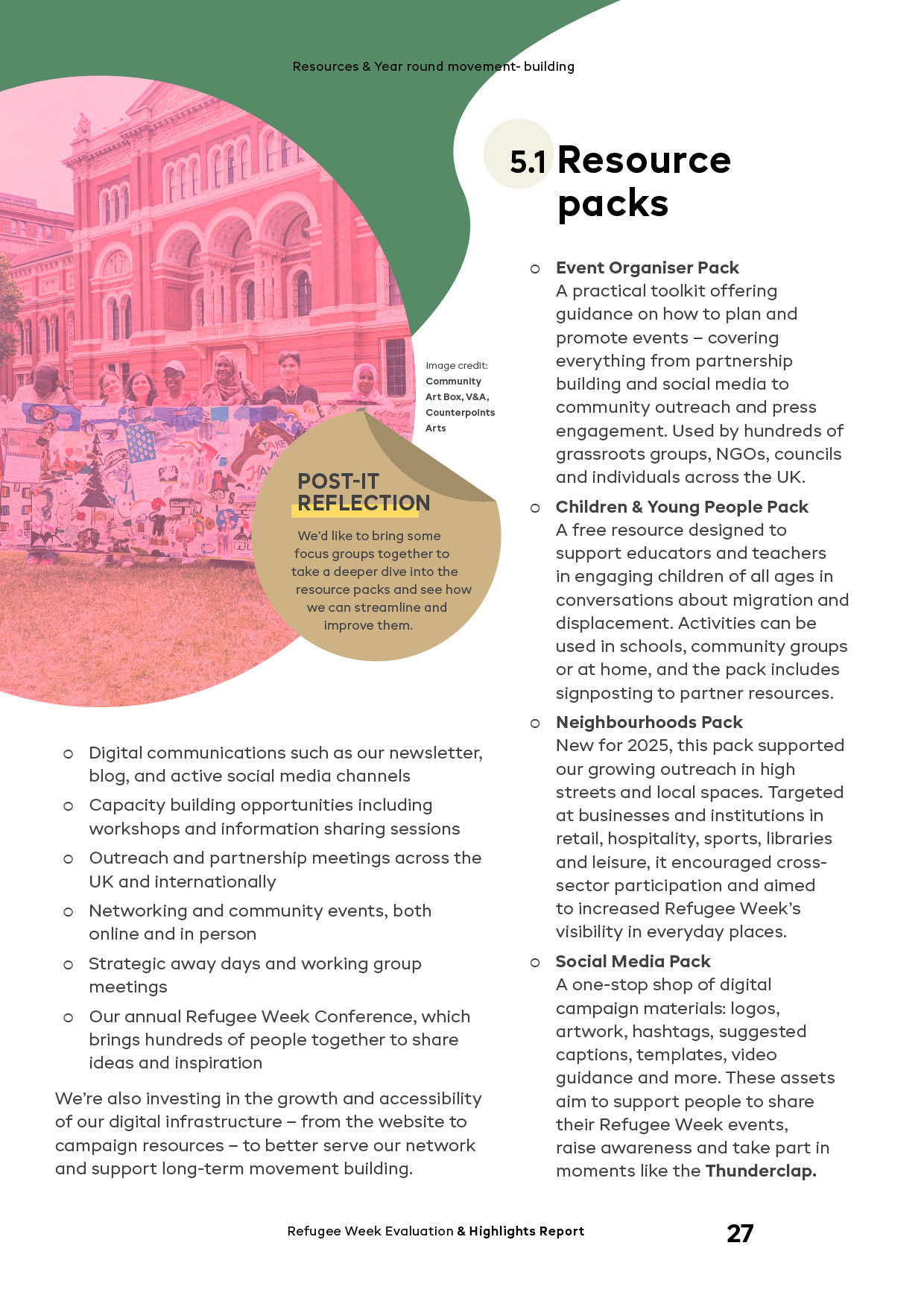
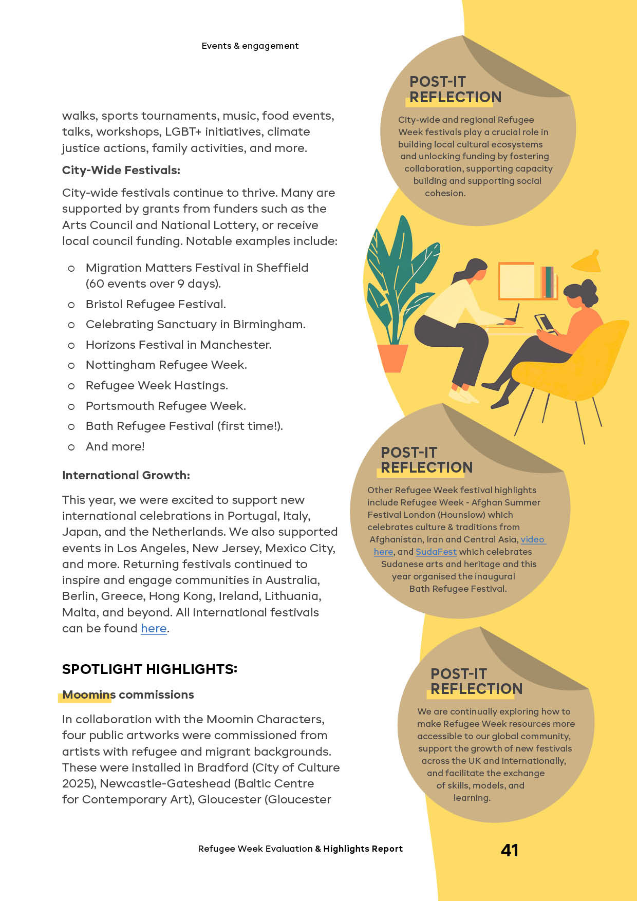
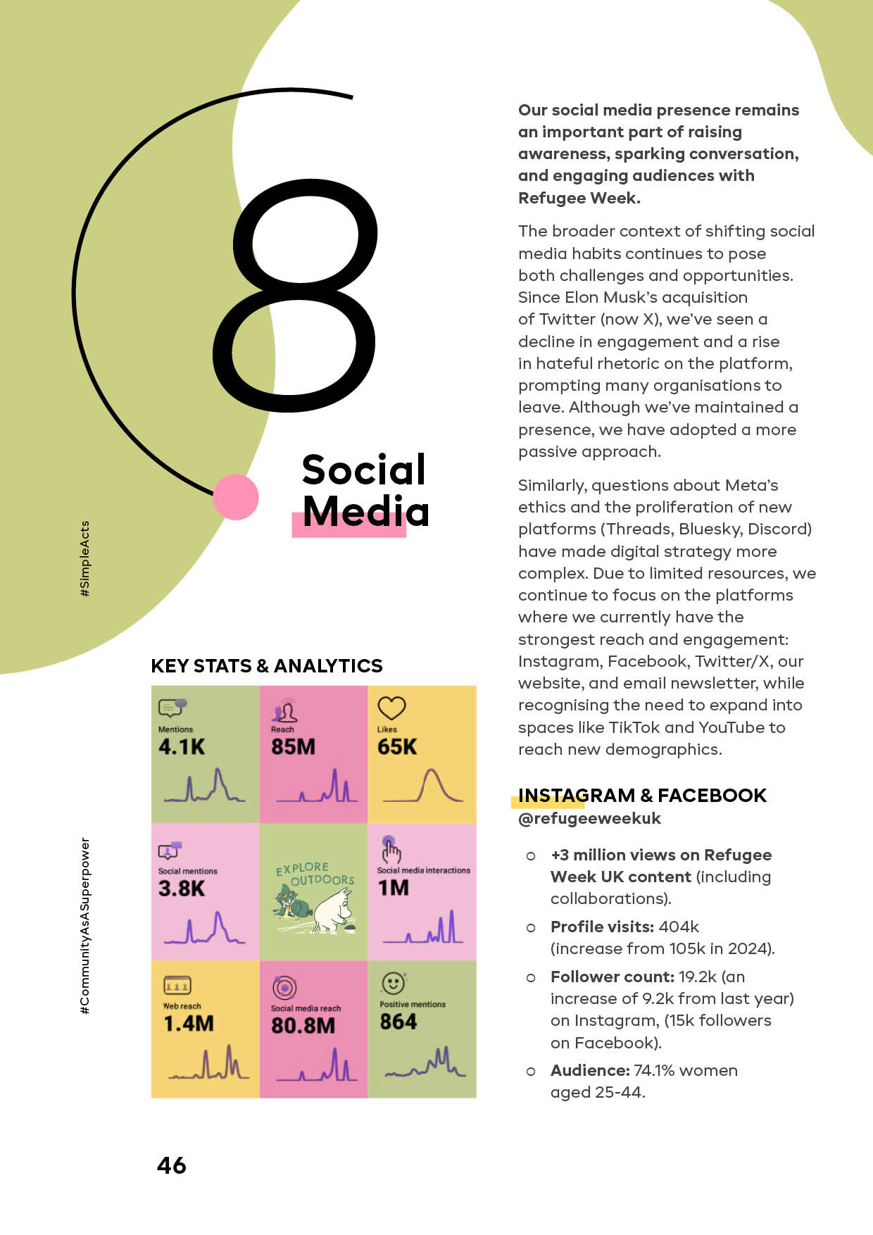
The central milestone of the project was the Refugee Week 2025 interactive report built as a digital publication with a large number of external links to sources, partner materials and social media. The task was more than making elements clickable, it required designing link architecture and navigation logic so the reader could quickly orient themselves within the volume of information and understand how different parts connect.
The solution is grounded in editorial design and a clear compositional system. A structure built to function at the same time as:
⇢ a content hierarchy where priorities are immediately legible.
⇢ a clear reading route supported by a modular grid, typography and block rhythm.
⇢ a unified way of presenting sources, maintaining functionality, click-through access and accessibility across the publication.
Visual concept and the Moomins
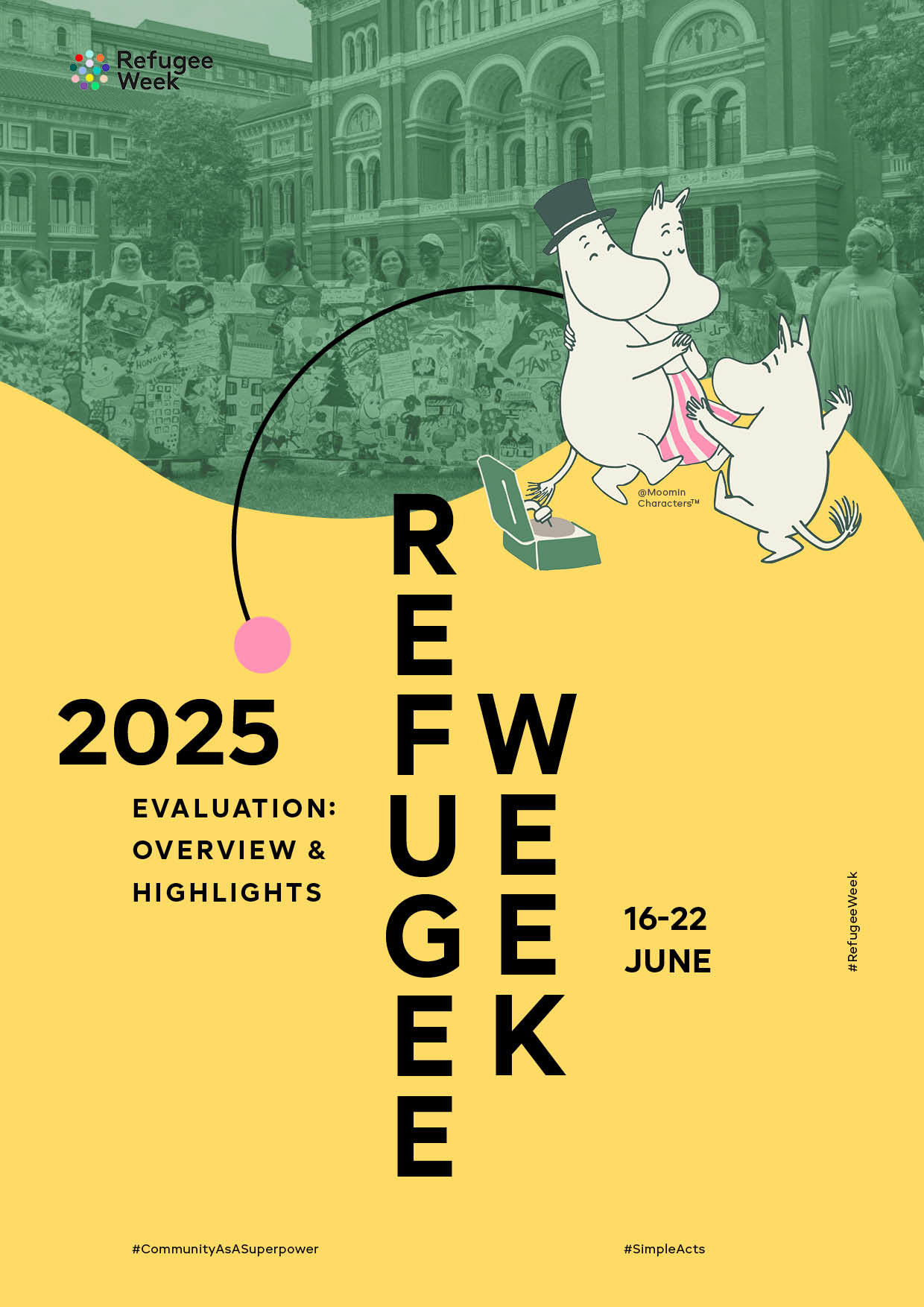
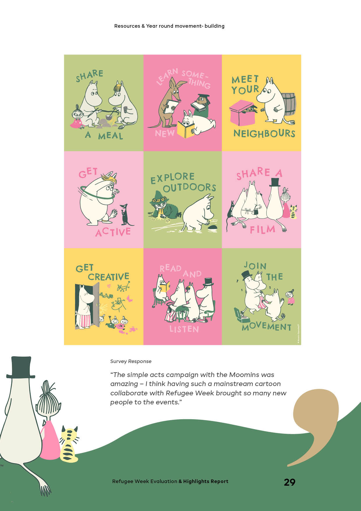
The visual foundation of the project was the world of the Moomins, one of the central components of Refugee Week 2025. By the time the work began, there were already established artistic materials, illustrations, posters and stickers, and it was important to bring them into the report while preserving their character, recognisability and tone, and still assembling everything into a cohesive publication.
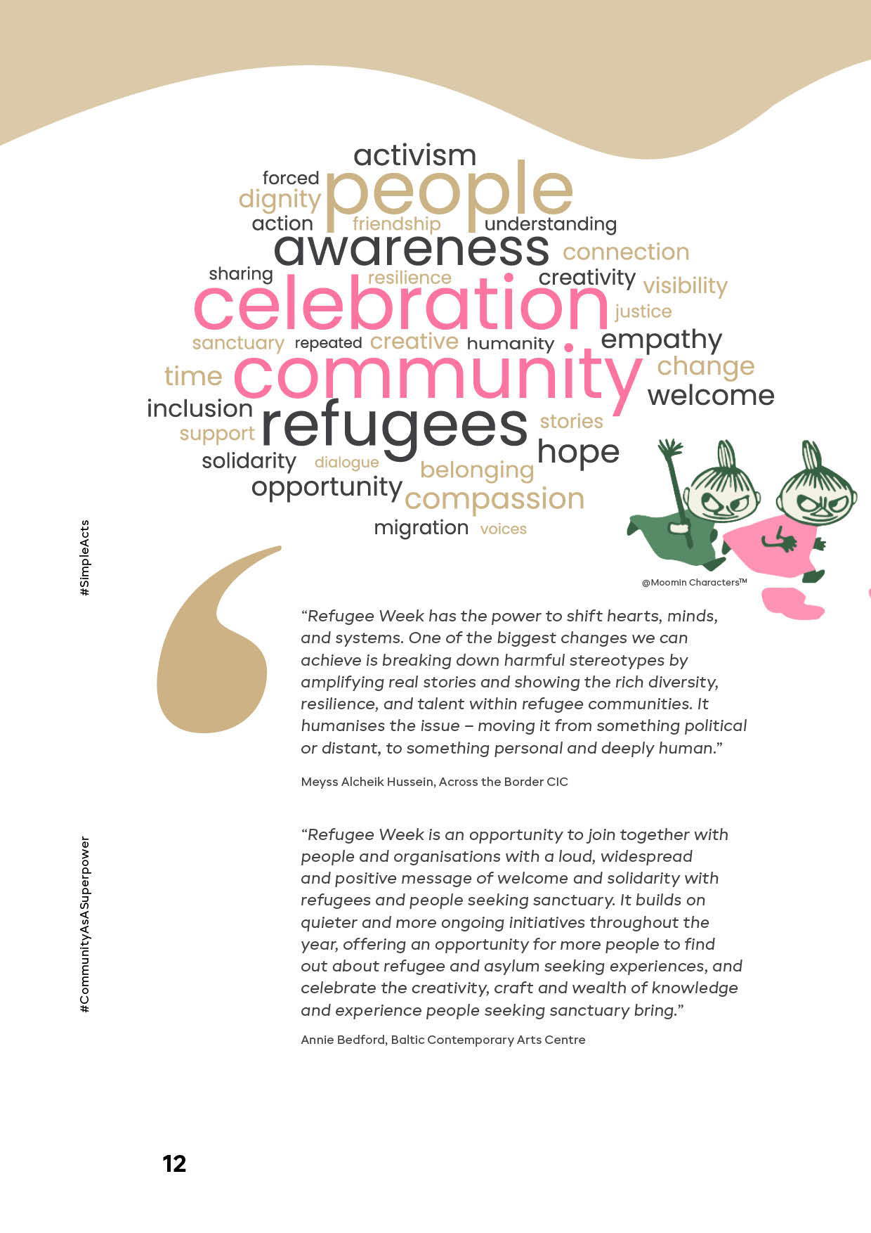
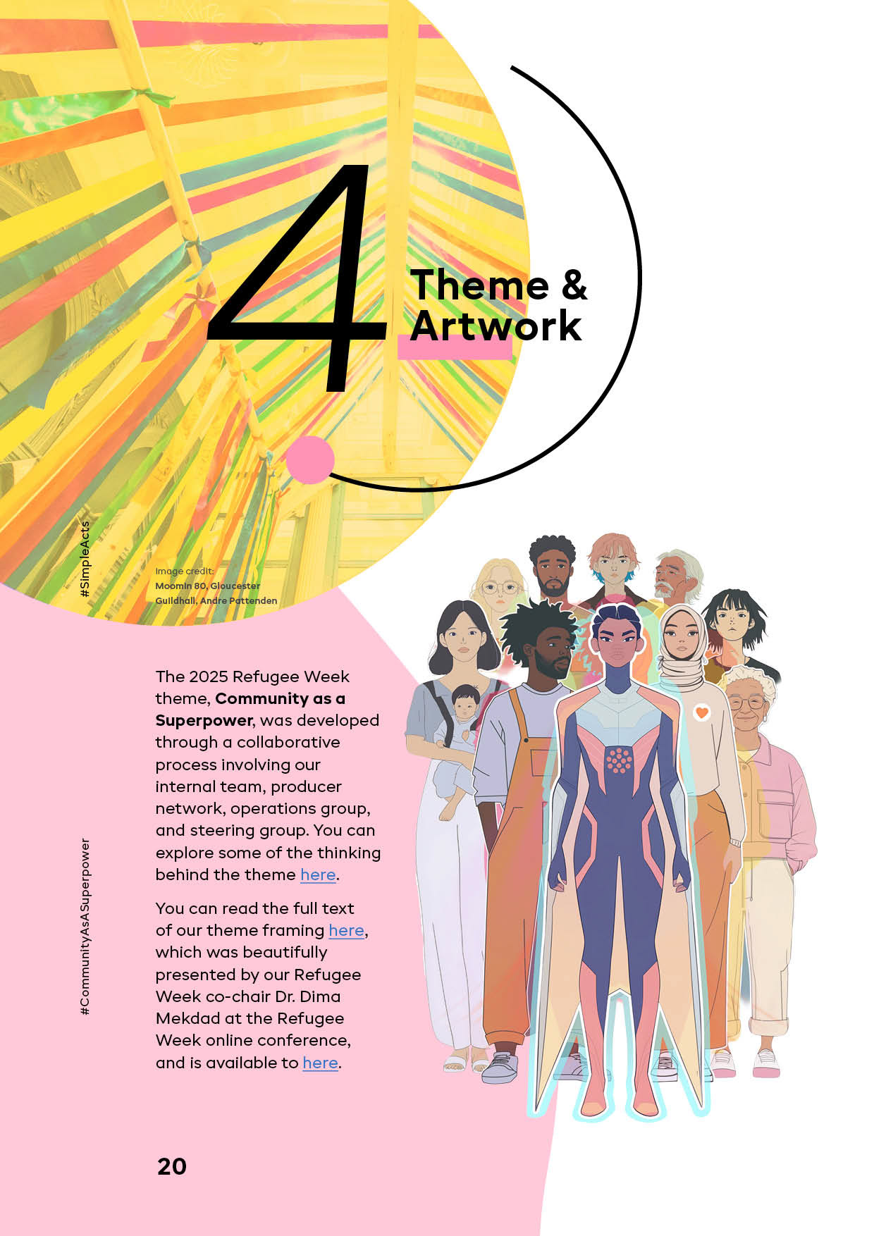
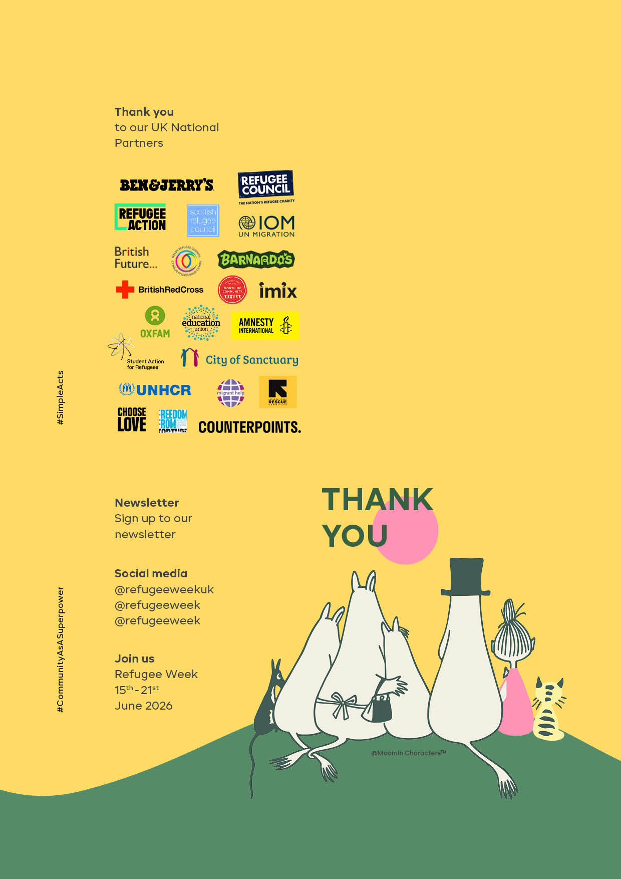
The characters became more than decoration, they formed a careful narrative layer: connecting sections and setting the tone, helping the publication stay coherent despite the variety of content. The colour palette was based on the original Moomins artwork and subtly supported by Refugee Week identity tones, keeping warmth and visual unity without a clash of systems.
There was also a very light personal note. The Moomins were part of childhood memories for me and one of the most anticipated places during a trip to Stockholm. It is interesting to meet them again years later through my work, now they quite literally guide the reader through the project I created.
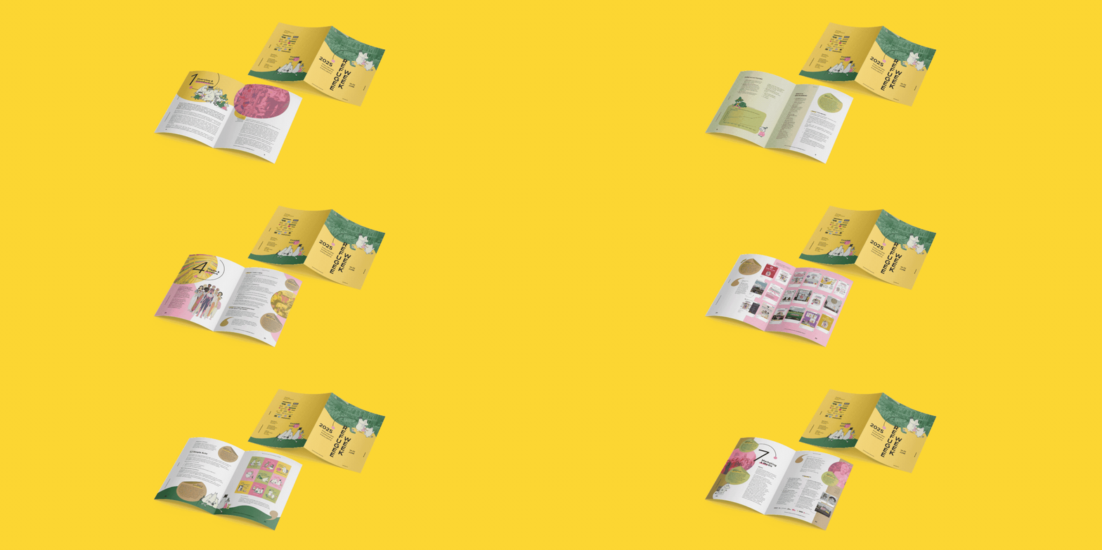
Diversity of materials, one reading logic
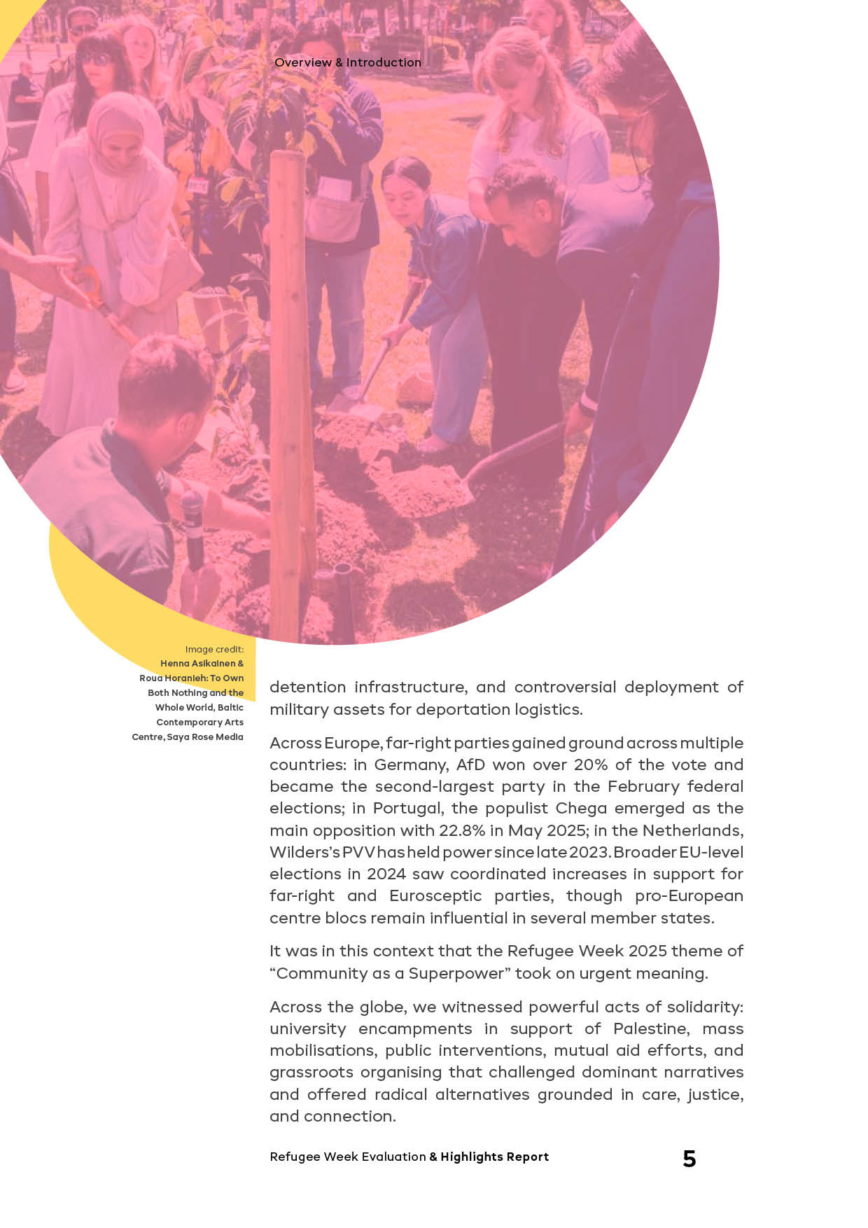
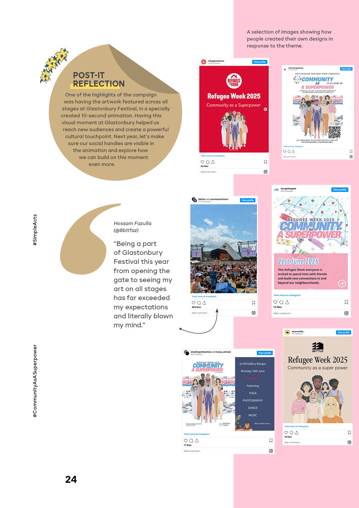
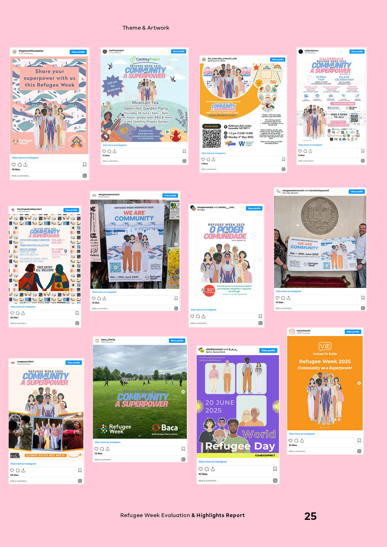
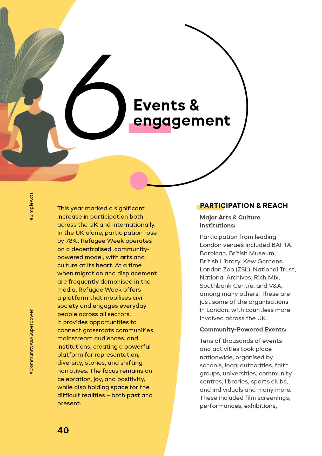
Alongside the Moomins, the report featured art and community projects from across the UK, work by artists and photographers, and initiatives by different organisations. Each contribution had its own strong and individual visual language, and the main challenge was to present this diversity and scale without visual noise or loss of focus.
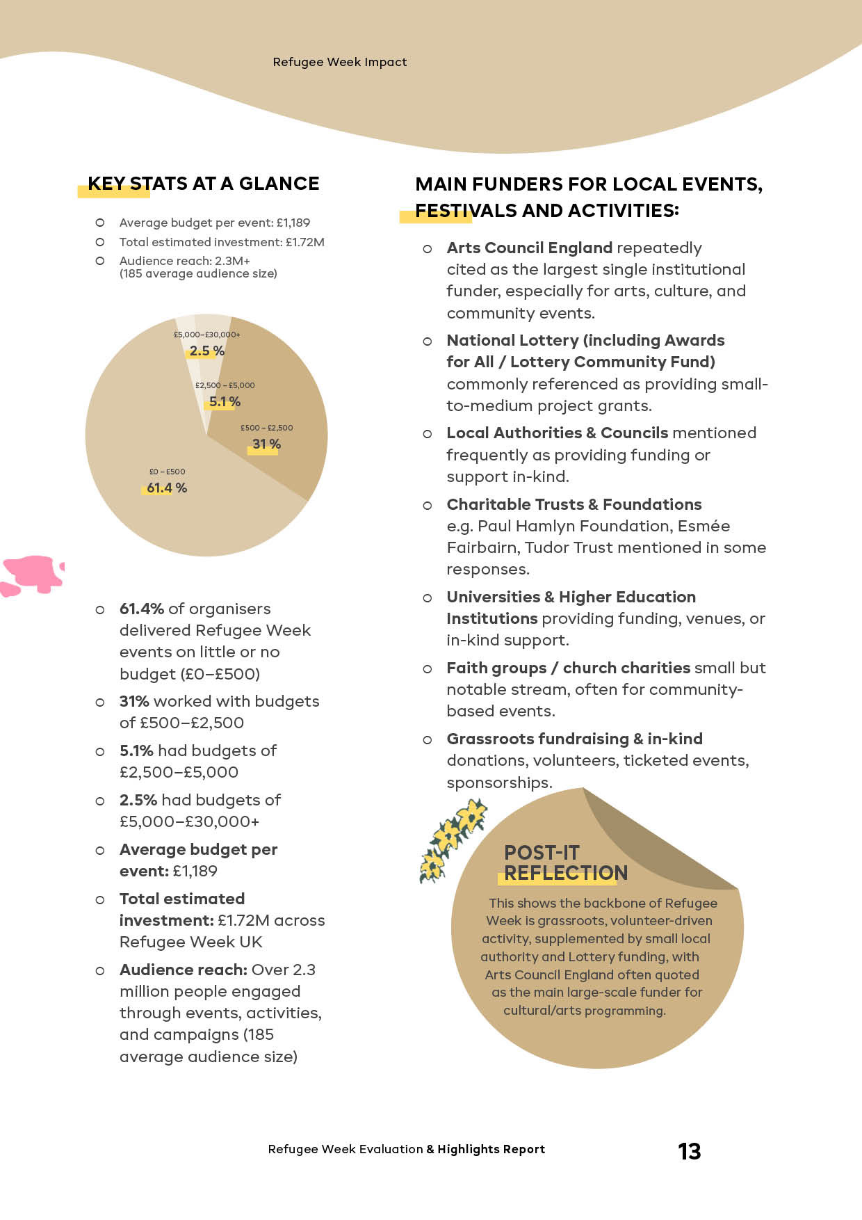
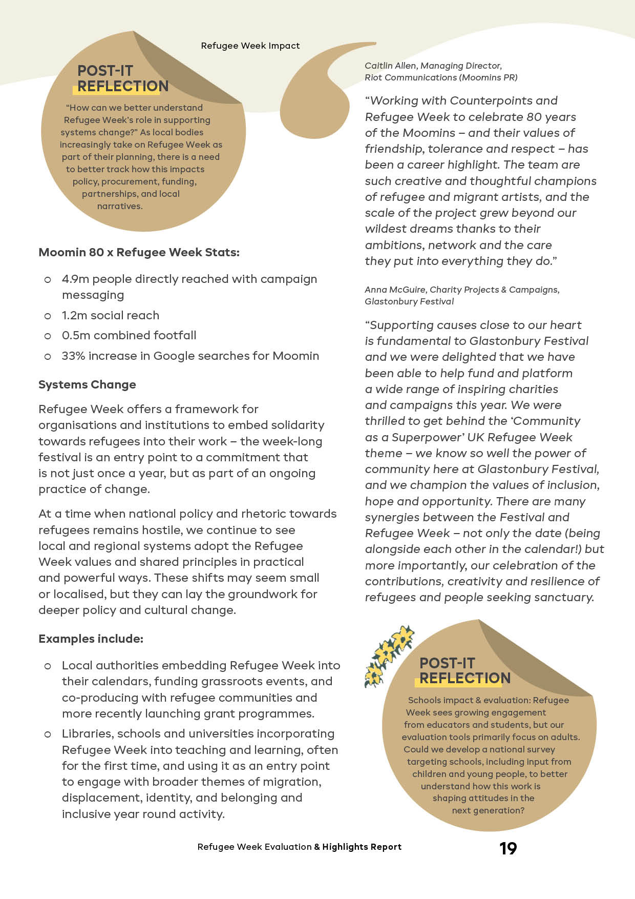
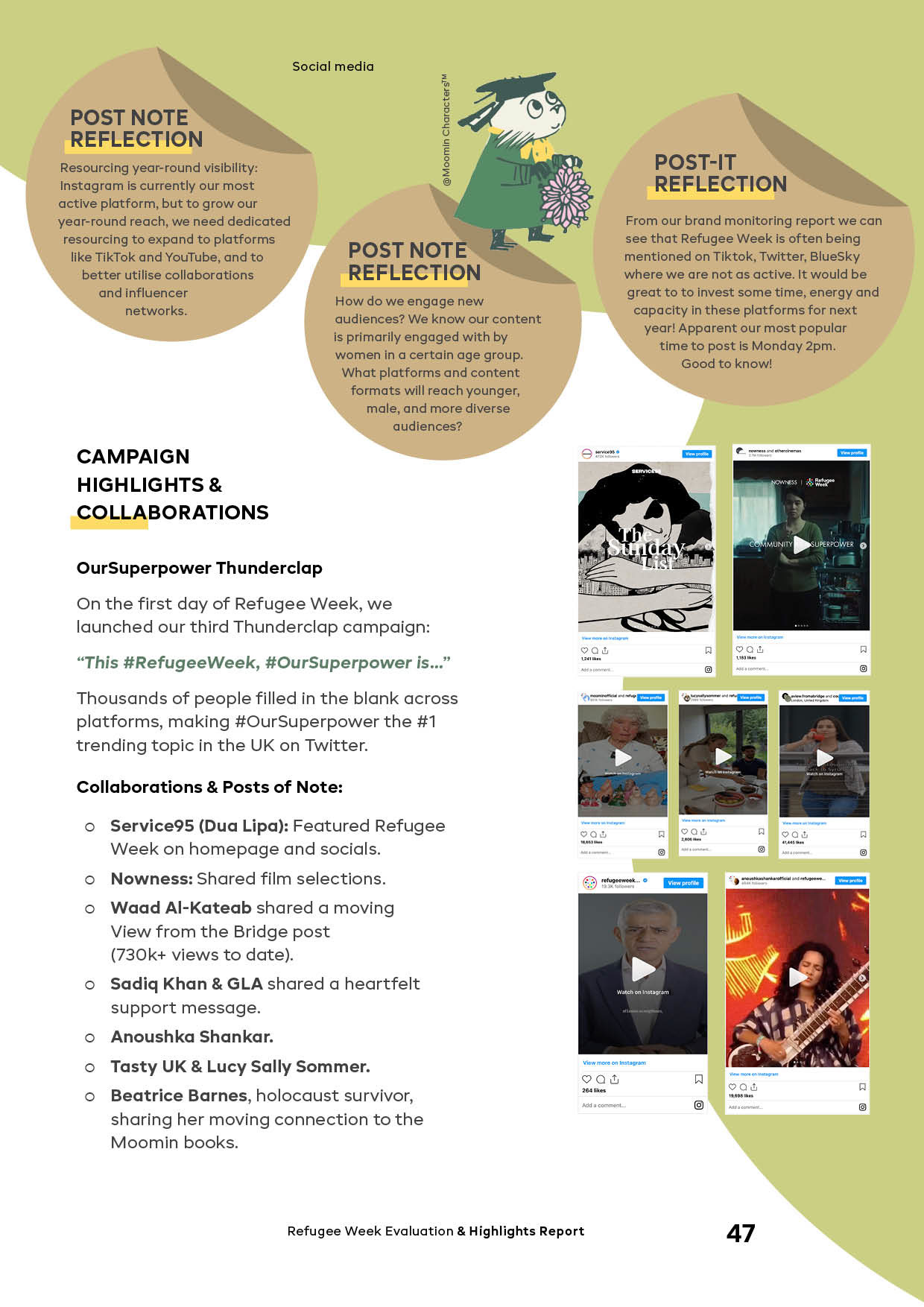
This was addressed through an editorial approach: a modular grid, a refined typographic hierarchy, page rhythm and clear navigation markers that keep the publication cohesive and readable while respecting the identity of each material.
During the layout development, we introduced “Post-it Note Reflections”, brief questions and thoughts inspired by an exhibition the team had visited. The challenge was to embed them naturally within the page system, so they felt spontaneous but still designed and readable. Small details like this matter to me, they make a publication feel shared, and therefore more meaningful.
The written content was also varied, sometimes analytical and structured, sometimes more open and narrative. During the process, opportunities emerged for infographics and data visualisation, introduced selectively where they reduced cognitive load and helped key conclusions read faster. The goal remained the same: to preserve clarity without simplifying the complexity and multi-layered nature of the project.
Overall, each part of the project sits at the intersection of visual communication, research and community initiatives. At the centre of my practice is structure, clarity and the way design supports navigation through complex information, especially when many voices, organisations and perspectives share the same space.
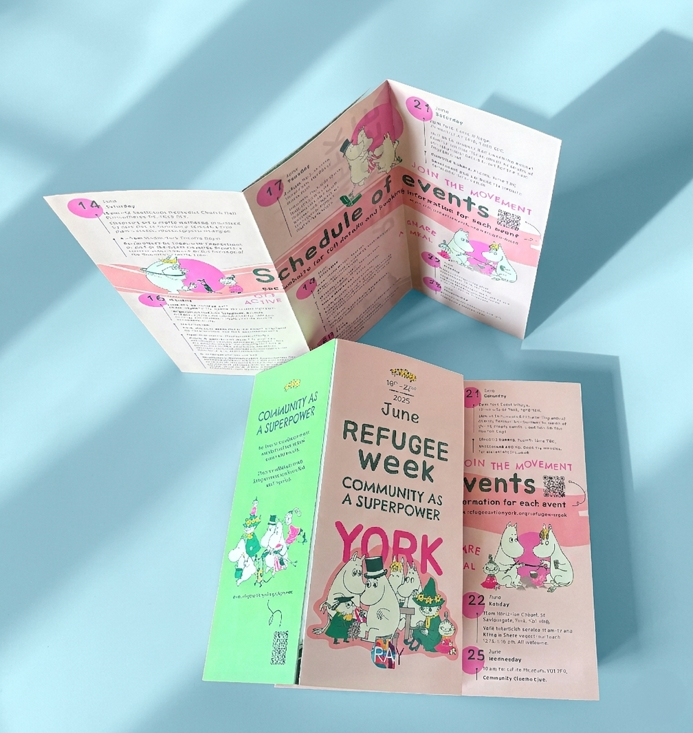
Refugee Week Leaflet
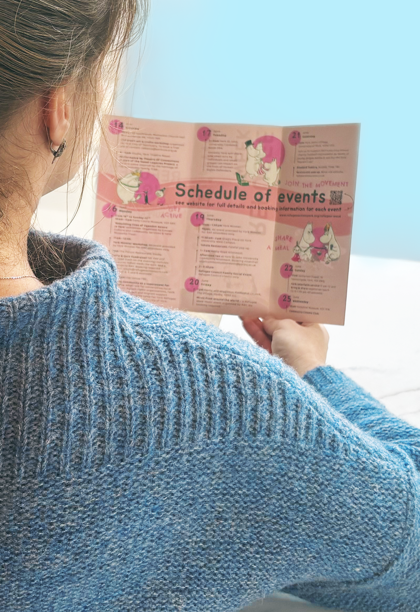
Refugee Week Events Programme
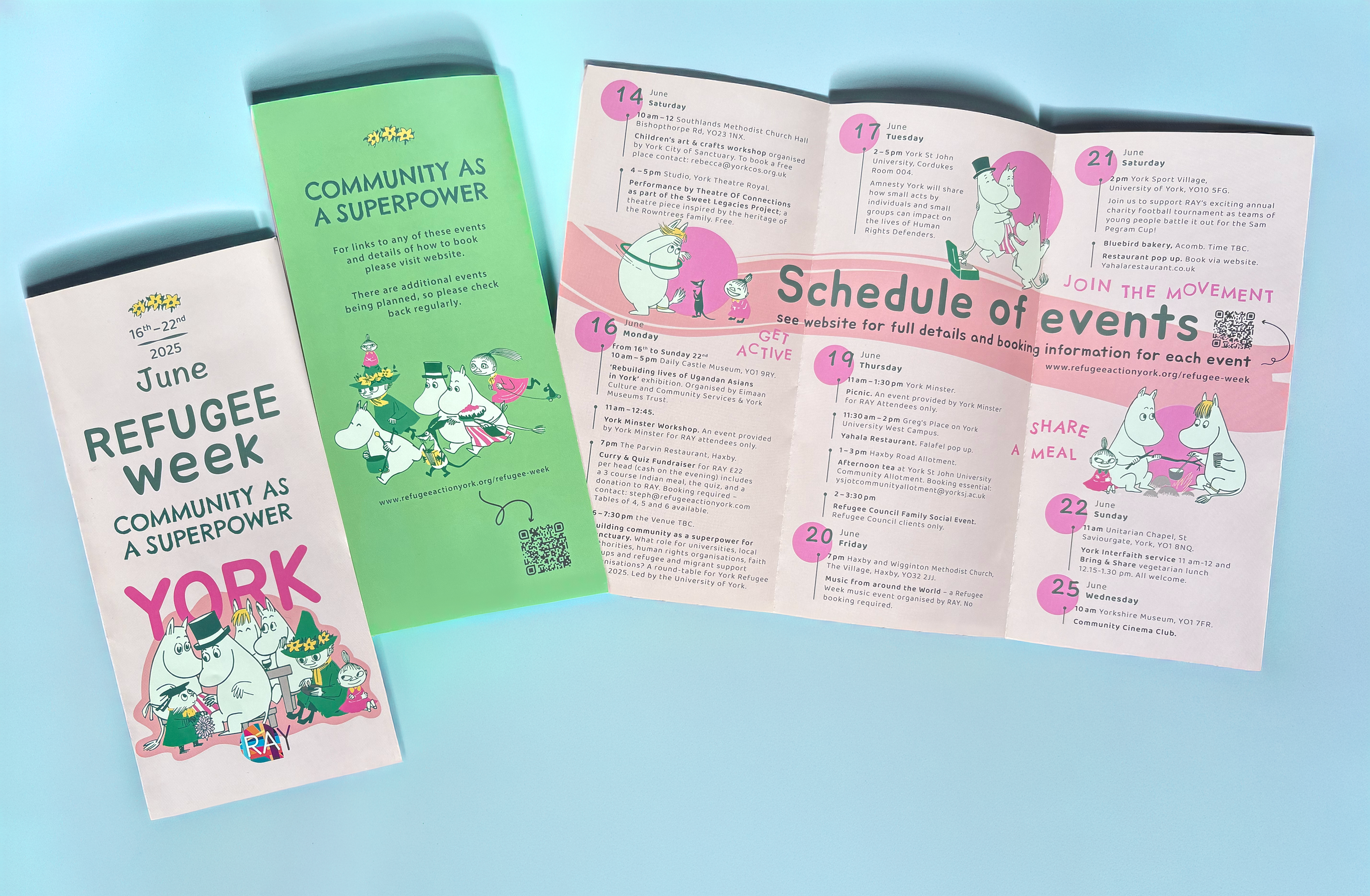
Refugee Week Leaflet York 2025
Additional communication materials
For social media, it was important to add motion to the existing visual system. Simple animation made the characters feel more alive and closer to the audience, and the post became a clear entry point, connecting public-facing communication with the main report.
The events programme leaflet brought a rich programme into a clear, compact and welcoming format. Refugee Week includes many events and each organisation contributes its part, so the task was to carefully unify a large volume of information and make it easy to scan quickly in a local, public context.

Feedback and Reflection
Lara Deffense, Refugee Week UK & Global Coordinator
“Firstly just to say WOW, the design looks absolutely amazing amazing, thank you so much for all your hard work on making this report, it looks absolutely brilliant and even better than I was hoping for, I can't wait until we share it! I can imagine that our network is going to really enjoy it.”
For me, it matters that the Refugee Week theme resonated with a wide audience. There was a lot of warm feedback from the client team and wider partners, as well as from the community, and it opened new doors to collaboration on future projects. It genuinely felt like a new turn, a sign of trust, and a confirmation that the visual work was clear, purposeful and valued.