
The project focused on bringing together several interconnected Refugee Week formats within a single visual system. The Theory of Change establishes the strategic framework, toolkits support participants in engaging with the initiative in practice, and Refugee Week on Air extends it into public and cultural communication.
My role was to make all of this work as one, visually and structurally. Design acts here as a connecting layer, holding this multi-layered structure together while making materials clear, consistent and usable for different audiences.
What was delivered
⇢ The Theory of Change Presentation.
⇢ Toolkits.
⇢ Refugee Week on Air Logo and Template.
Key Achievements at a Glance
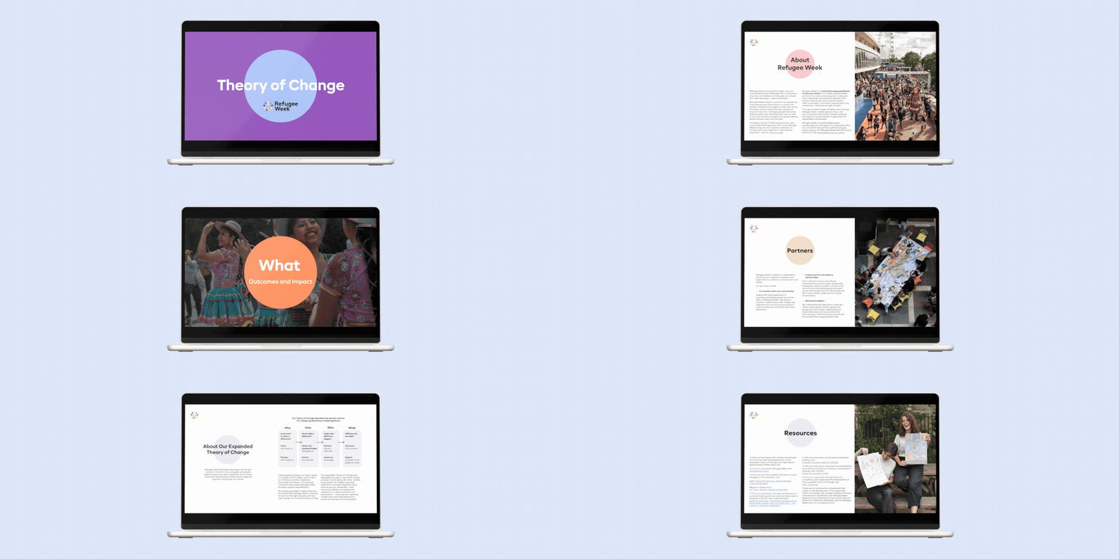
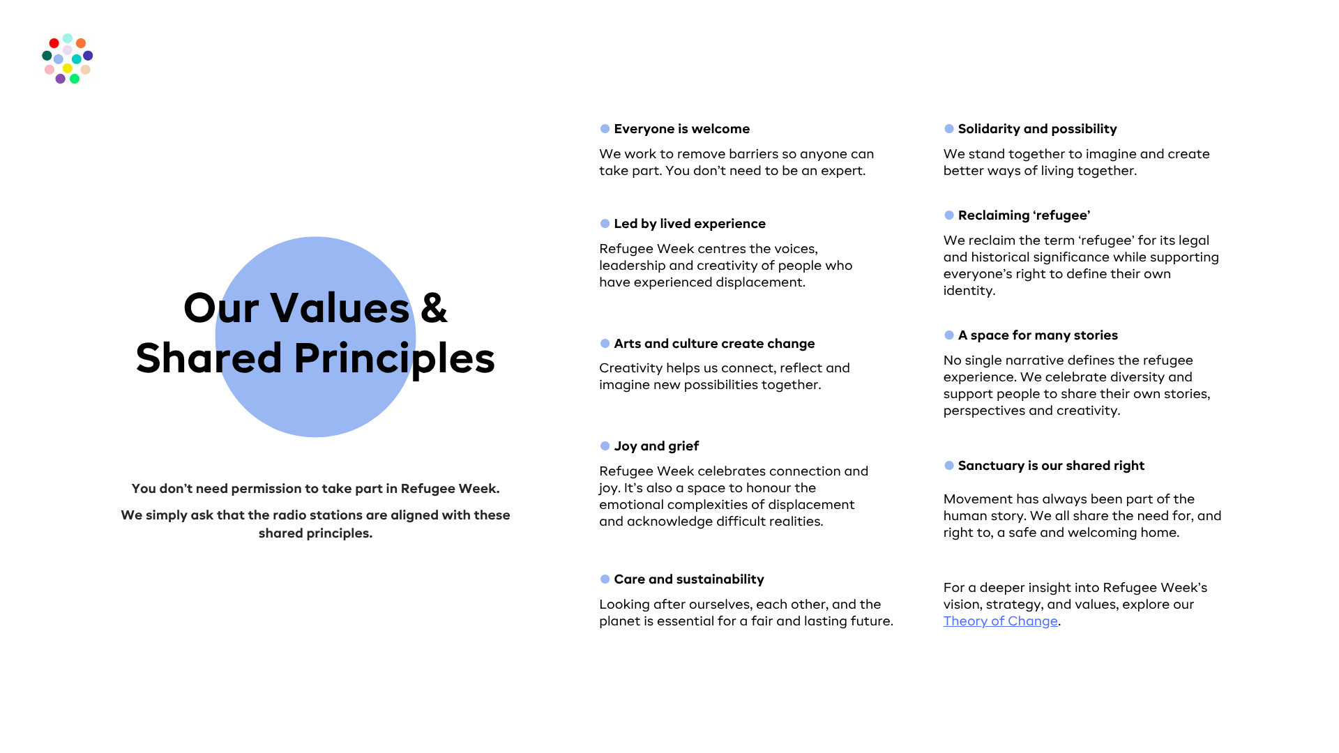
⇢ Strategic model presentation. A Theory of Change developed as a clear strategic map, translating complex relationships between goals, actions and audiences into a structured, easy-to-navigate system supported by targeted infographics.
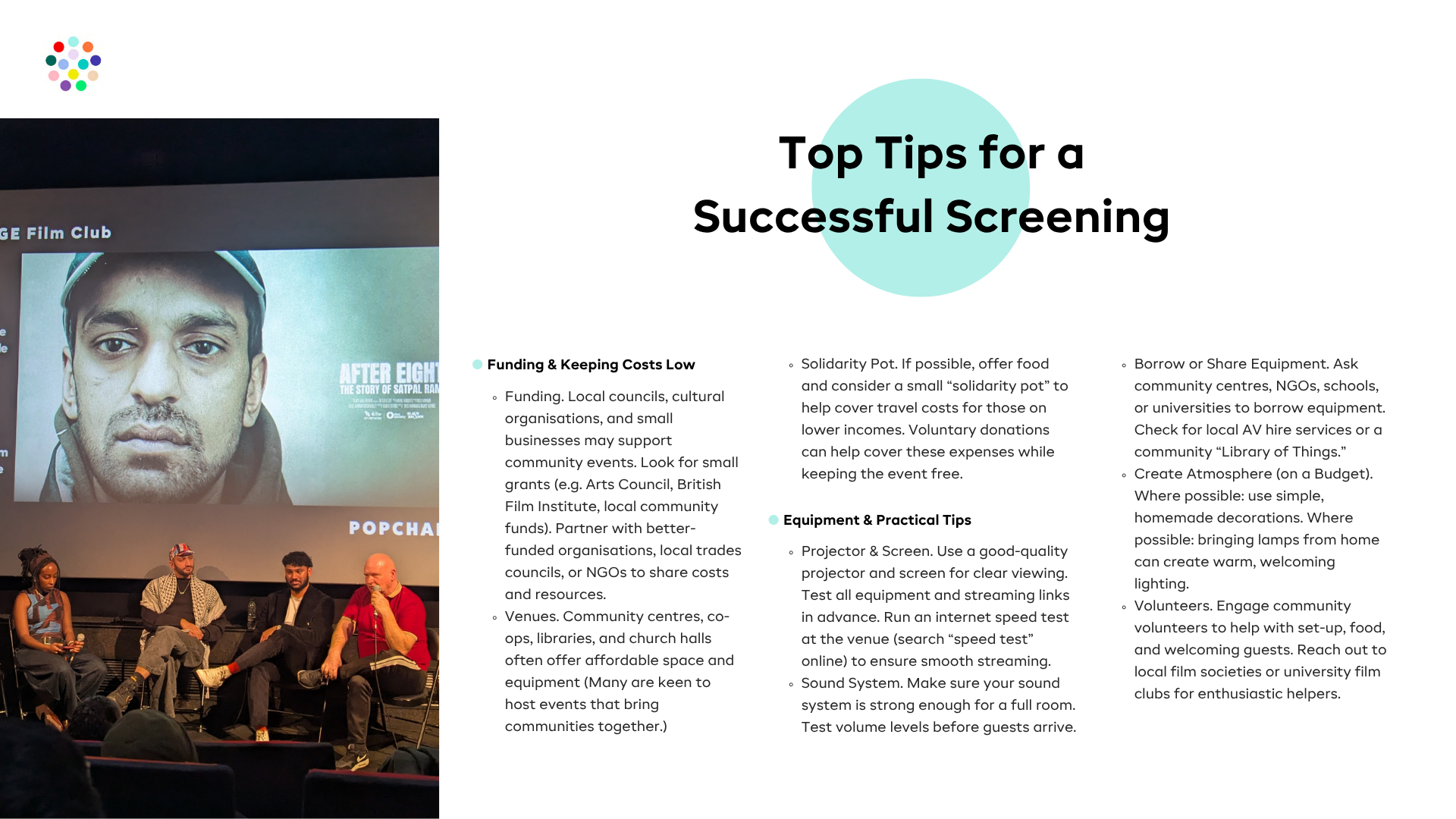
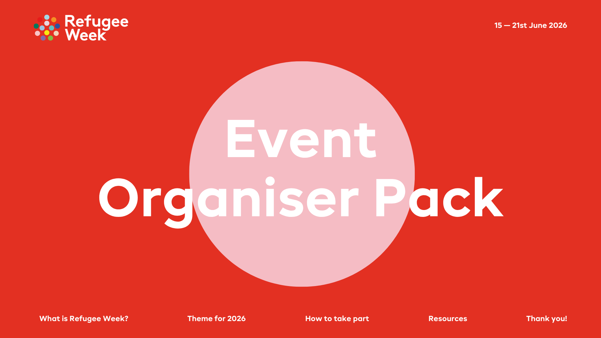
⇢ Toolkits. A scalable toolkit system redesigned from theme-based layouts into a consistent brand-driven framework, enabling faster updates, easier navigation and collaborative editing.
⇢ Refugee Week on Air identity. A flexible identity system aligned with the core brand, ensuring visibility, consistency and usability across distributed radio formats.
A strategic model presentation
So, what is a Theory of Change?
At its core, it defines the purpose of the work, outlining the change the initiative aims to create, and the actions, values and partnerships that support it.
In simple terms, it works as a map: a structure that connects intention with action.
Design translates this model into a clear and navigable system, where the structure itself supports understanding.
In simple terms, it works as a map: a structure that connects intention with action.
Design translates this model into a clear and navigable system, where the structure itself supports understanding.
Information is organised in layers, allowing the reader to move from the overall strategy to specific audiences and actions without losing context. A flexible grid supports different levels of content density while keeping the layout balanced and easy to follow.
Infographics are introduced where they clarify relationships and help key ideas be understood faster.
Infographics are introduced where they clarify relationships and help key ideas be understood faster.
The result is a structured document that supports discussion, alignment and practical use of the strategy.
Toolkits
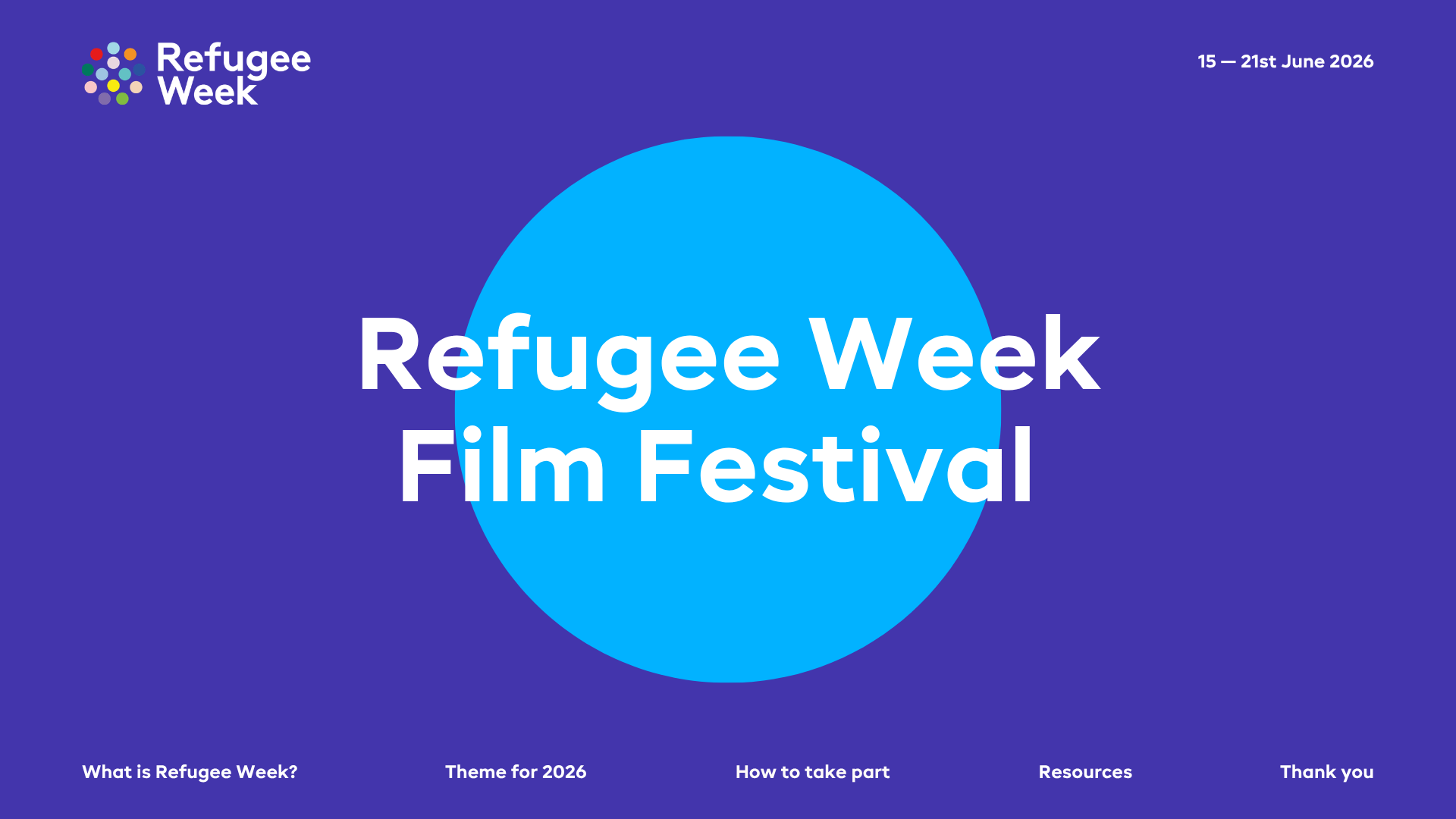
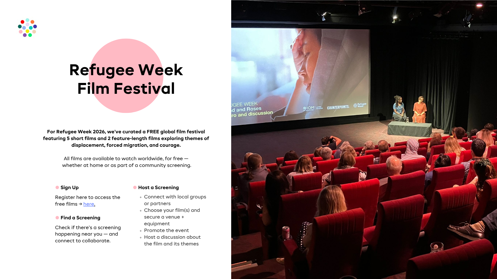
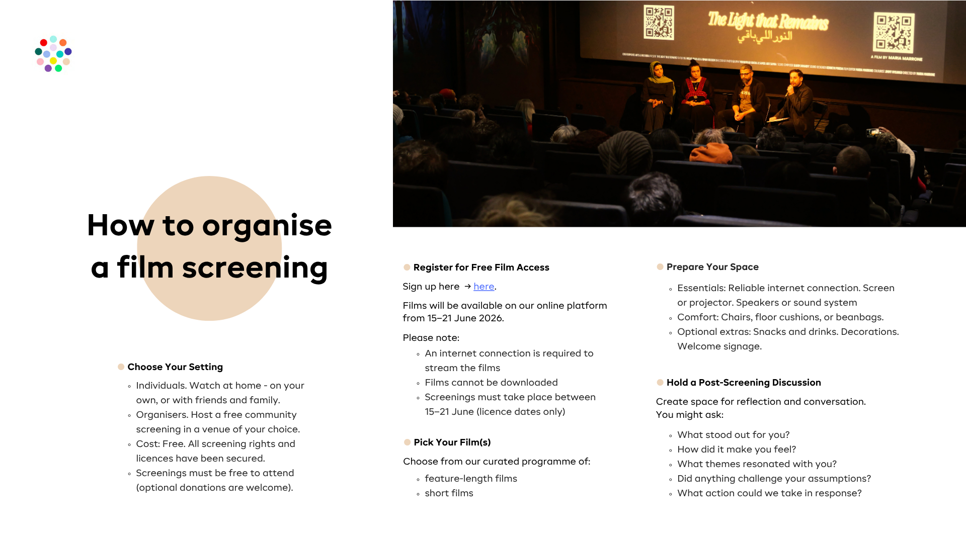
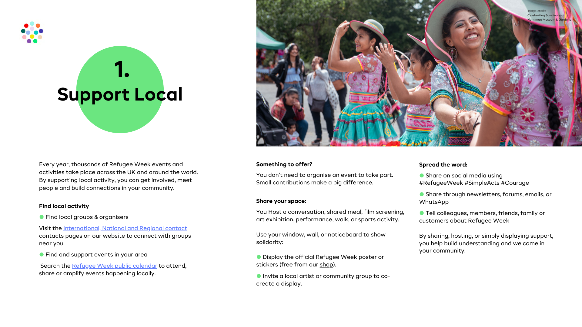
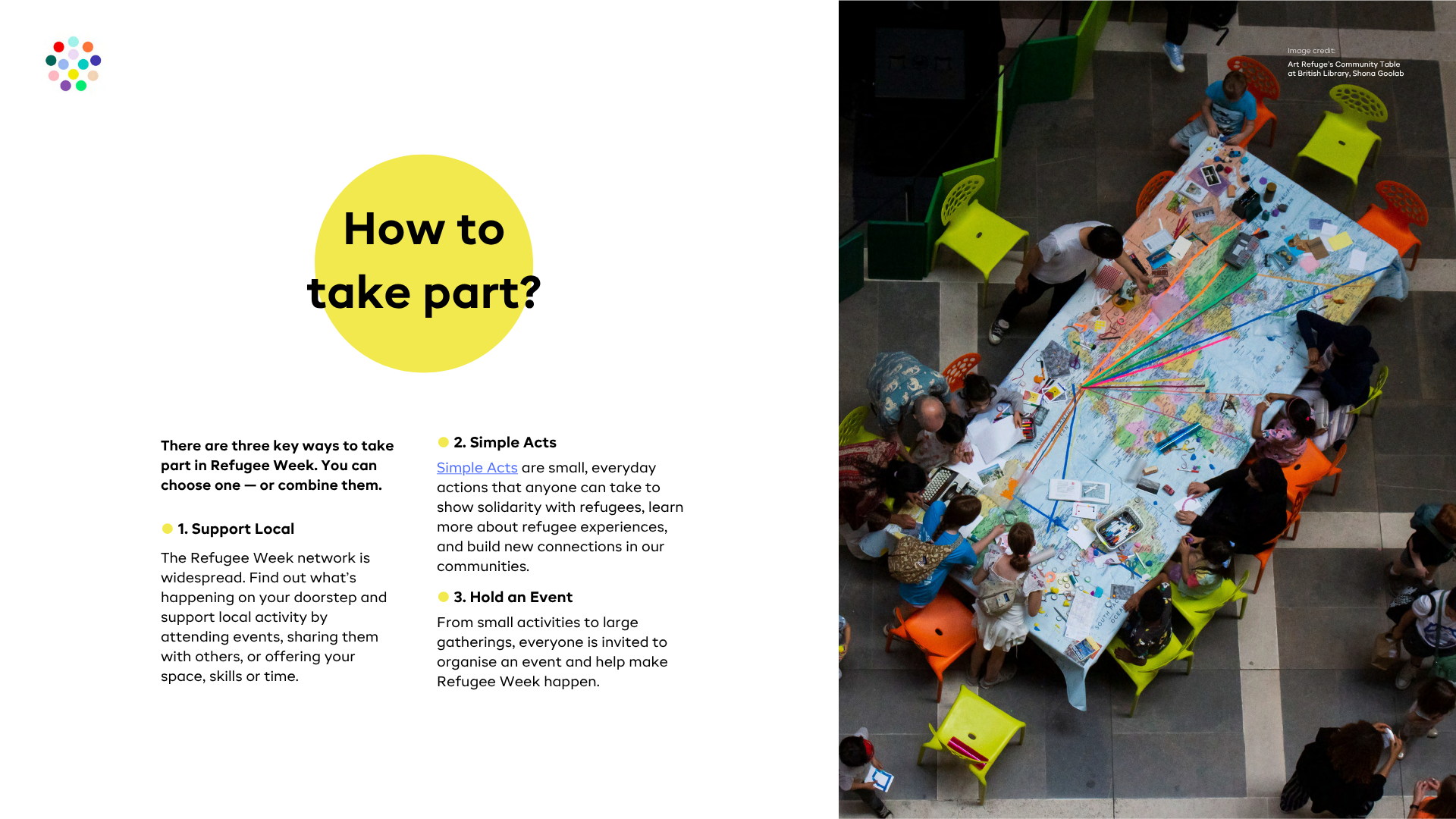
The toolkits take the strategy and turn it into something people can actually use. Different formats, different audiences, but all part of the same system.
Before this, materials were rebuilt every year around the theme, which made the process slower and the output fragmented.
I shifted this approach to a consistent visual framework, where everything connects and can evolve over time. The annual theme is still present, but now sits within the system rather than defining it, making the materials more stable, easier to update and more coherent overall.
The way we worked was just as important as the outcome. Content and design were developed in parallel, in a shared environment. The Refugee Week team updated content in real time, while I was structuring, organising and shaping the material at the same time.
What usually becomes a cycle of back-and-forth edits turned into a smooth workflow. It reduced friction, improved clarity and helped us move faster than expected.
Refugee Week on Air
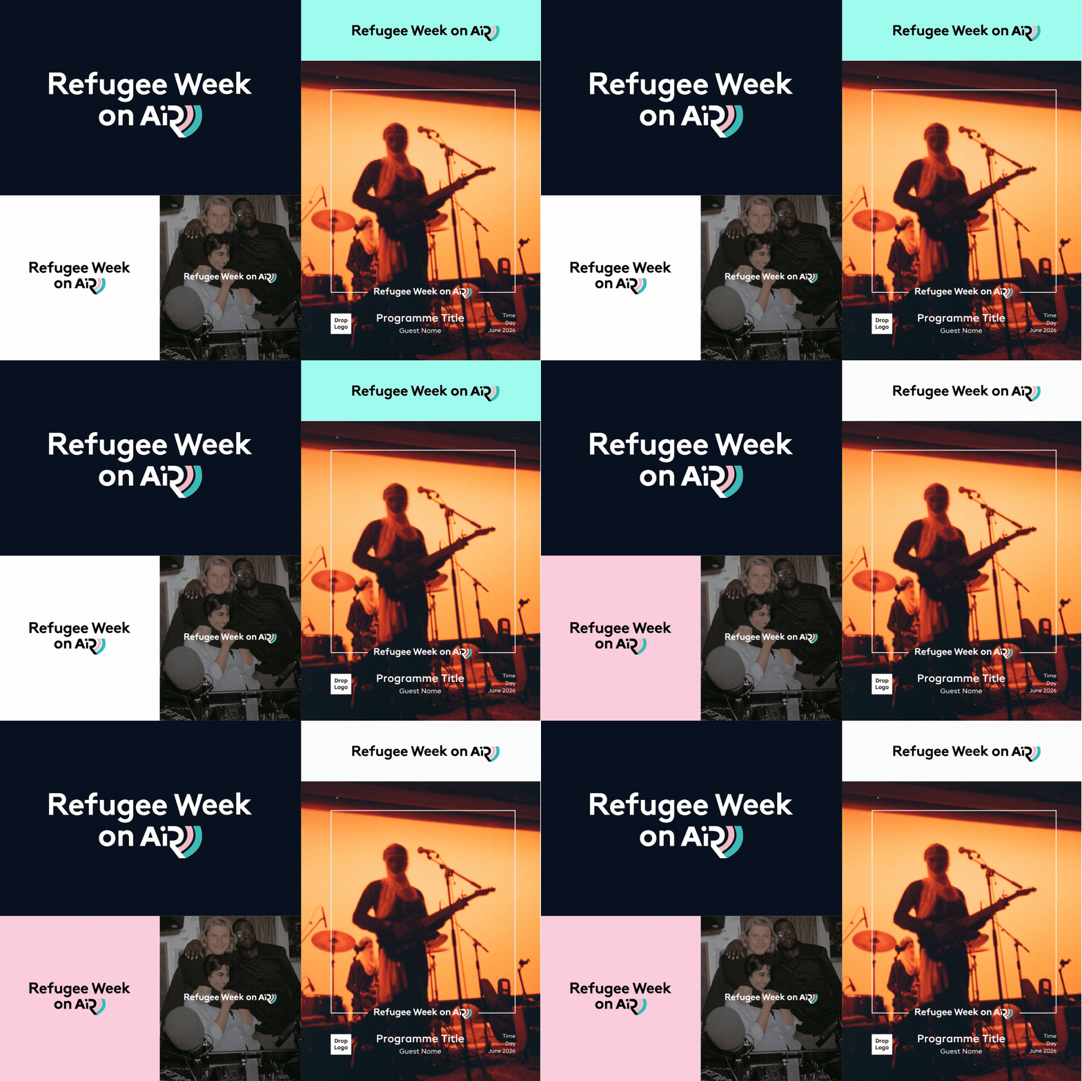
Refugee Week on Air has been growing into a more independent part of the initiative, and it needed an identity that could hold its own while still feeling connected.
I built the system using the core typography and colour palette of Refugee Week. This brought the project back into the brand while making it more visible and recognisable.
Previously, the visuals were tied to the annual theme and worked only in isolated cases. That made the project feel disconnected and easy to miss within the wider campaign.
A key focus here was visual stability. The logo is designed to work in one or two lines, with light and dark versions that stay readable across different formats and templates.
The template system allows different contributors to create their own materials while still producing something consistent. It’s simple enough to use, but structured enough to hold the identity together.
Bringing it together
All parts of the project, strategy, toolkits and communication, now work as one system.
The value of this work is in how it functions. It simplifies complex information, connects different formats and makes everything usable in real situations.
The value of this work is in how it functions. It simplifies complex information, connects different formats and makes everything usable in real situations.
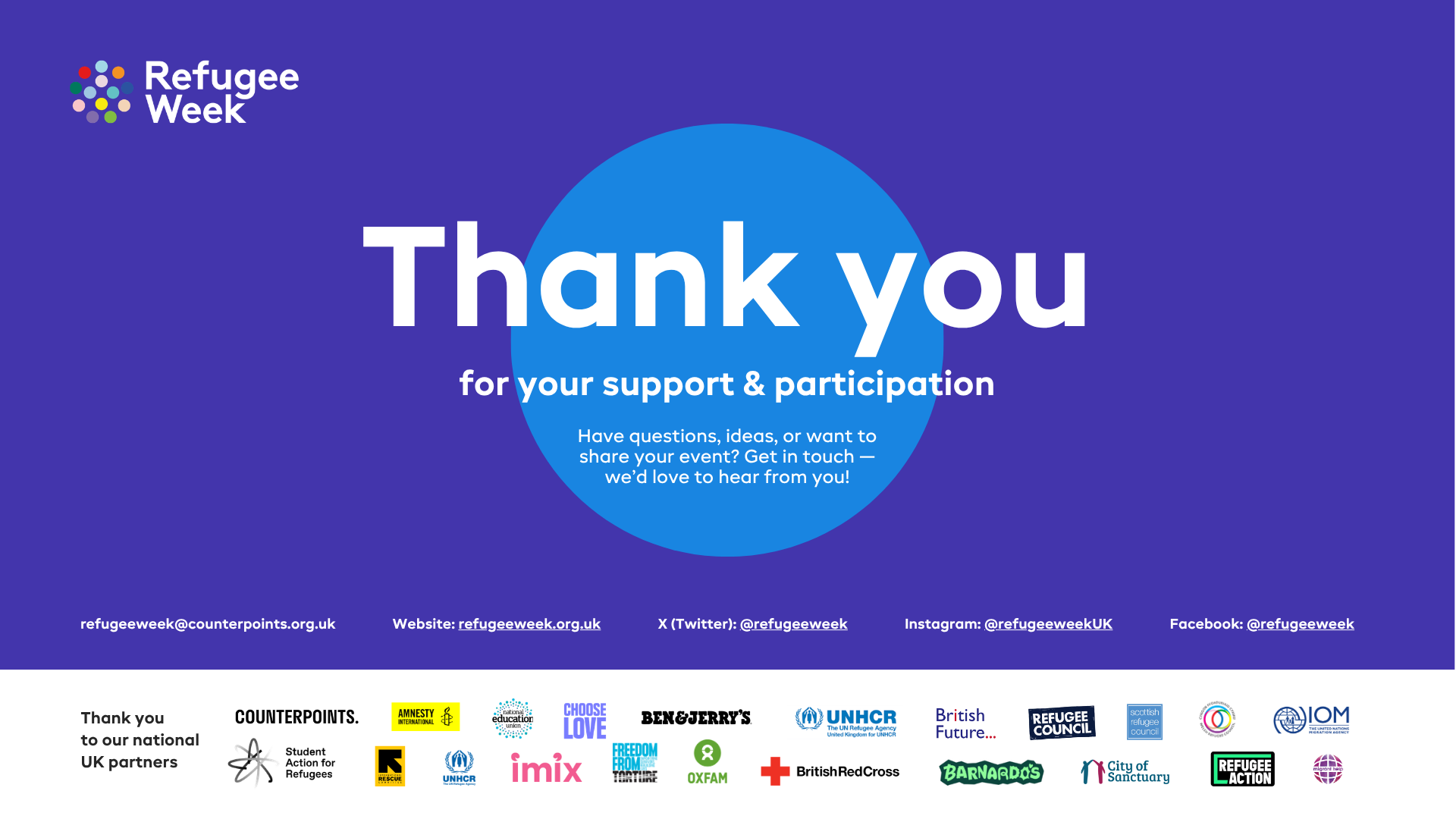
The collaborative process with the client became part of the solution. We worked simultaneously in a shared environment, with ongoing edits happening in parallel. This turned feedback into an integrated part of the workflow, helping maintain momentum, reduce unnecessary iterations and deliver a stronger result overall.
Feedback
Gaby D'Annunzio, Freelance Producer (Refugee Week On Air & Music Programming)
“I just wanted to thank you again for the designs, it was such a pleasure working with you, and I absolutely love the final output. Everything looks great on my end and is good to go :) ”
Lara Deffense, Refugee Week UK & Global Coordinator
“This is wonderful, thank you so much!! You've done great work on these! We had the conference today where we launched everything and we had over 951 attendees! We also shared the toolkits and a colleague from HEAL collective said a thank you to you for your design <3 Thank you so much for all your work on this!!”
"Thank you so much again for all your work on the Theory of Change. It looks amazing, we’re so happy with this. It’s a great piece of work and document. You have done a great job. We really appreciate your patience as we worked through multiple revisions with input from many people. We LOVE it! The document is looking so beautiful, it’s looking incredible. Warm wishes"